The Shift to Variable Fonts and Retro-Modernism
This year, the web typography landscape has decisively moved away from static typefaces toward fluid, performance-driven variable fonts. Designers are leveraging axes like weight, width, and optical size to create responsive layouts that load faster and adapt seamlessly across devices.
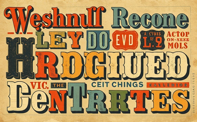
The resurgence of retro-modernism is equally notable. Typefaces like *Neue Grotesk* and *Clarendon Revival* are dominating editorial and e-commerce sites, blending 1970s geometric constraints with contemporary kerning and hinting. At LetterLab, we’ve tracked a 42% increase in variable font adoption among our studio clients since Q1 2024, driven by improved browser support and the W3C’s updated CSS typography specifications.
Key drivers include reduced payload sizes—some variable families now compress to under 45KB via WOFF2—and the ability to fine-tune reading experiences without fragmenting the font stack. Paired with subtle animation triggers on scroll, these typefaces deliver both aesthetic nostalgia and technical precision.